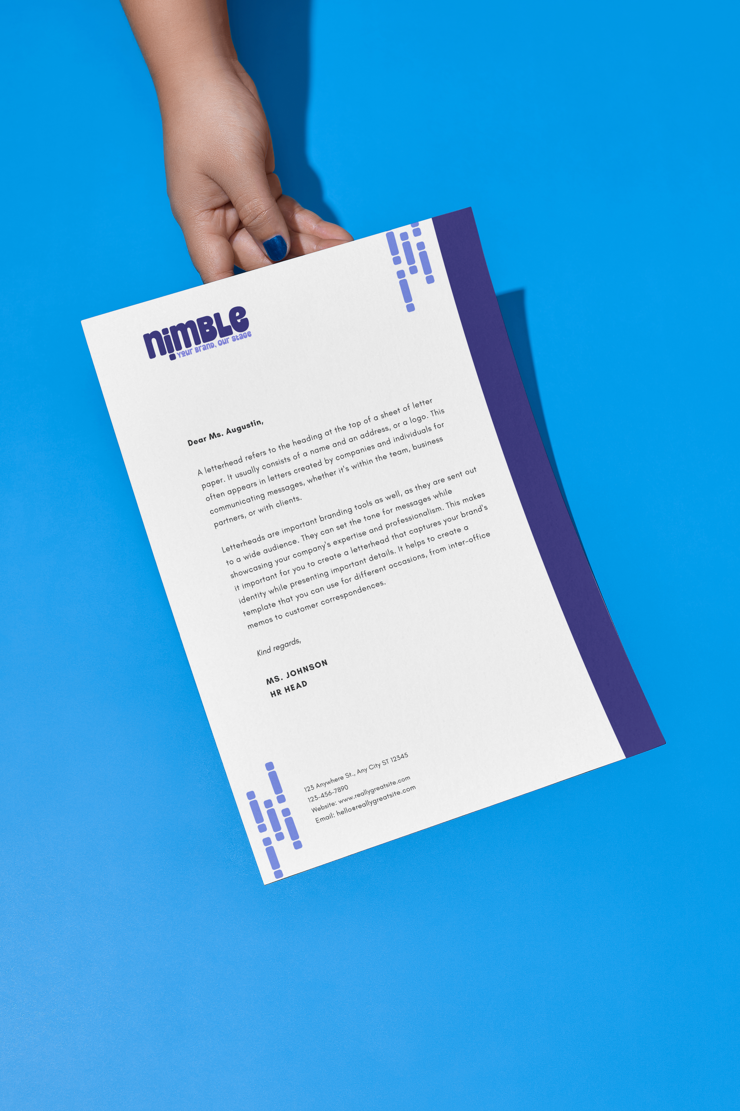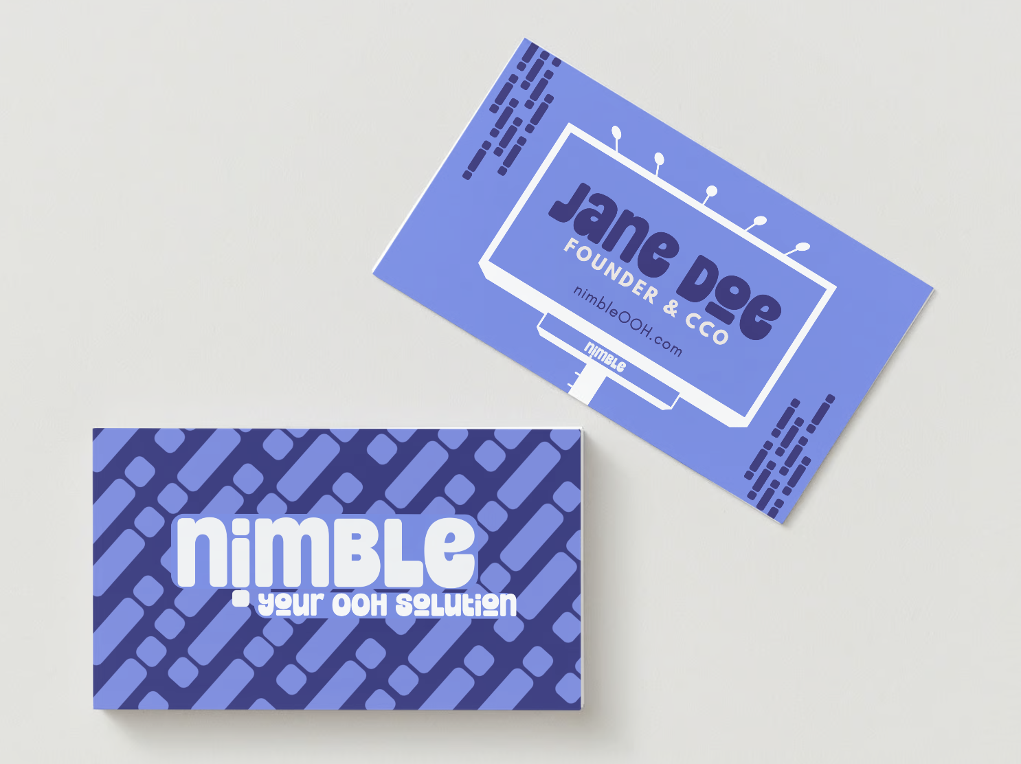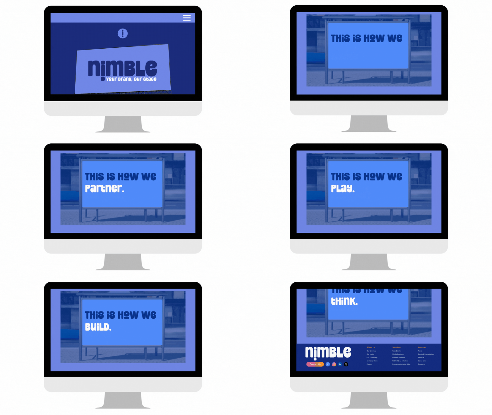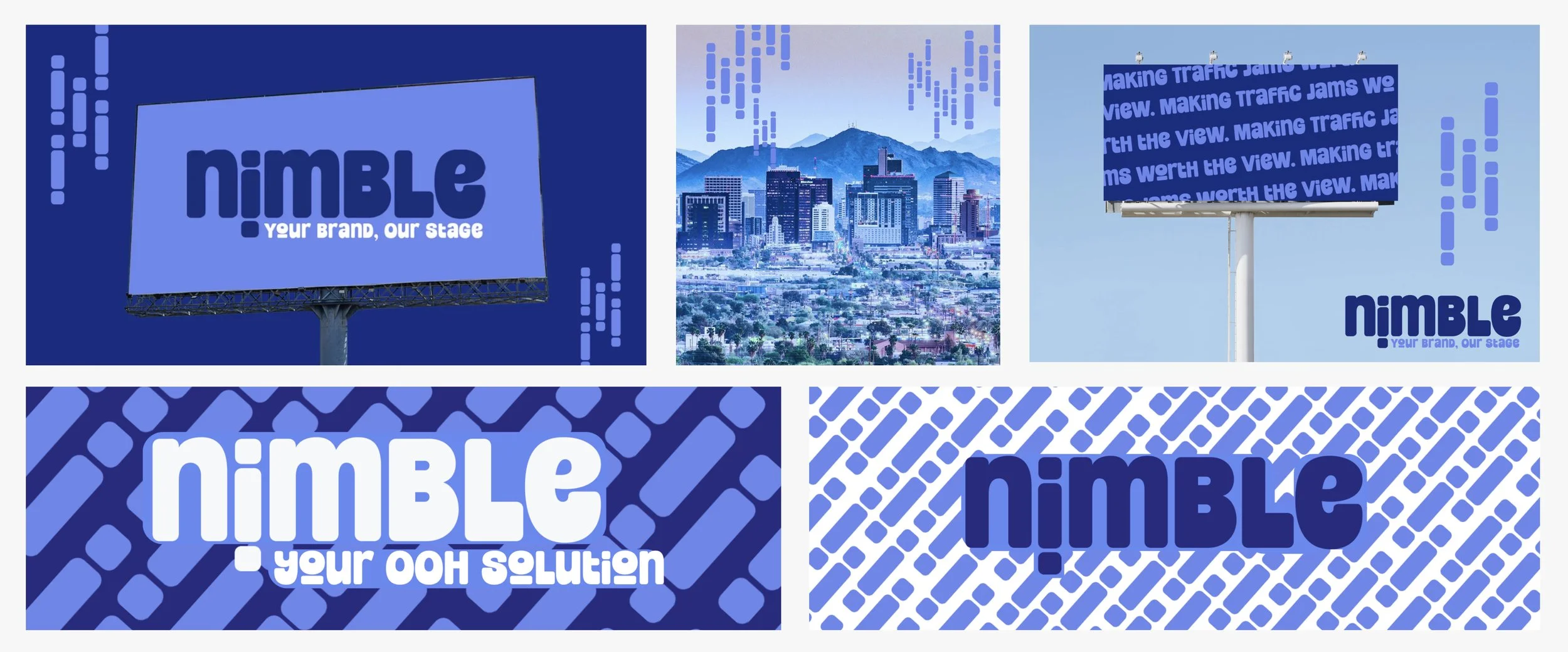
Welcome to the reimagined design of Nimble, where innovation converges with tradition, resulting in the future of out-of-home advertising. My aim was to infuse a sense of playfulness and memorability into the brand, ensuring it captures attention and stands out.
The Design Approach
My vision was to break away from the conventional corporate design and present a more playful, youthful, and modernized approach to branding in this industry. The goal was clear: to establish a company at the forefront of Shaping the Future of Out-of-Home Advertising. The process of building this vision was not only fulfilling but also a lot of fun.At Nimble, we invite you to experience a brand that blends innovation with a touch of tradition, creating a unique and memorable presence in the world of out-of-home advertising.Brand Logo & Colors:
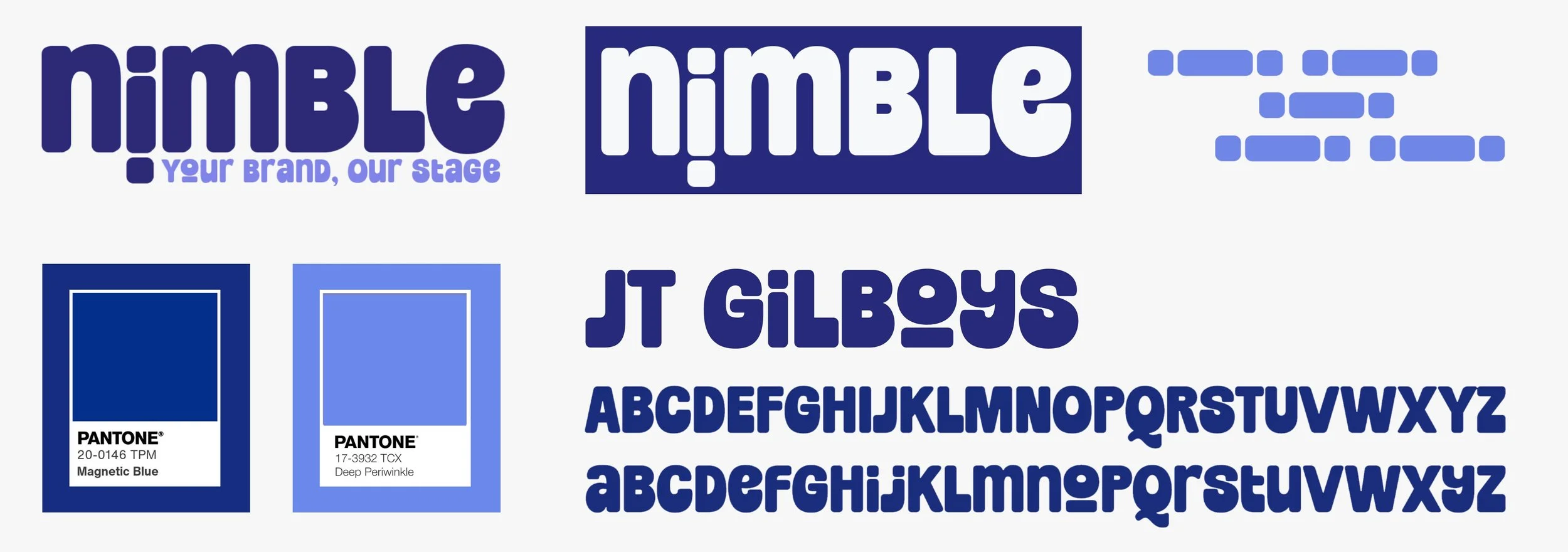
In approaching the logo design, I prioritized a fun, unique, clean, and modern aesthetic. The choice of JT Gilboys, a display font, brought unexpected delight. Inspired by bold and rounded vintage lettering, it exudes charisma and impact.I appreciate its playful nature, offering design flexibility through glyphs to create diverse appearances for your design, logo, or brand. I decided to use the iconic "I" to develop design attributes to compliment the creatives.Our primary color, a classic Midnight Blue, embodies depth, stability, timelessness, and trust—qualities integral to our brand. Paired with Periwinkle Light Blue, it introduces a refreshing and contrasting element, adding vibrancy to our visual identity.


